Thursday, December 17, 2009

Creating my Environment

First i asked myself why i decided and picked to make a bathroom scene for my environment. i picked the idea as i liked to create more space and more uncanny similar to gregory crewdson. So i thought adding an hand in a bathtub would create more suspicion and would look strange. but since i cant creat a human hand for the project i decided to make the bathroom without it. Slowly it didnt come out as i expect or i wanted soo i thought to add a doll to it and make the area more destroyed. Since i had very less space in the bathroom and there were nothing strange to be felt i came up to make the area more destroyed. 
As Jeff wall the destroyed room made a strange look towards it and made the objects to attract the surroundings. So i decided to spread my environment with a little more thought of the place being destroyed and to show a doll in the bathtub. i also had an idea of mixing some slight blood taint on the image.


this is just a short sketch for my environment  but it will take quet good time for me to creat the broken bricks and planks. i decided to remove the toilet flush as this might not highlight the bathtub. so i will make the toilet flush to be half broken and give a slight red and high white to the bathtub so the bathtub gets highlighted in the scene for ppl to notice the doll.
i havnt created the doll and the environment yet but i finished some simple stuff like the bathtub and  trying to get some good textures for my scene =/. it would be real help if i could get my hands on some blood tainted textures or cracks.
With Phil's lecture in photoshop it helped me to come up with a plan to creat the cracks in the wall and tiles of the image.


i created this one actually for the side wall of the image but i wont be using the whole image i would remove the huge crack between the wall as i decided to make the whole scene half destroyed. I will try and peal of half the  pain and add some mud bricks to make it look more realistic as the present image isn't much enough.


Finaly im adding some tiles for my ground.
Continue Reading...

Monday, December 14, 2009

MAYA PIRATE TREASURE (COMPLETE)


Continue Reading...

Thursday, December 10, 2009

VIDEO ANALYSIS WITH BARATHI

I just worked the movie analysis with Barathi as he called me up for the video. While i had some tough times working with the textures for ma scene. I enjoyed the analysis though it was a new start for me to talk about it in the vid. I also made some written work on the movie analysis but i was also thinking about some more alien movies like war of the worlds (2005)...
MOVIE ANALYSIS Invaders from Mars (1953)


Continue Reading...

Monday, December 7, 2009

3 new ideas =)

i got 3 ideas after watching couple of movies from the lecture theatre and learning more of uncanny images.
the first one would be the classroom.
i started to create the classroom and show whats it like when its empty, like no ones in the room but from all computers one computer stays on, as the rest are switched off.
The second one was to make the street of rochester and to add a alien look to it.
the final one would be more of a hand in a bathtub.
i wanted to bring an creepy idea and great sense in the image so i thought this might be real freaky stuff to work on =P..
Continue Reading...

maya scene unfinished (work on progress)


i been trying to creat a lightning scene through the window in maya for a while. As i had an idea of creating the a ray of light pass through my window and to show a bump in the bed as to make a feel like someones actually there but not. I plan to creat the curtains and add some depth to it with photoshop.. i should hopefully finish the lightning scene by today =/...
Continue Reading...

Repulsion (1965) Roman Polanski


Todays movie in the lecture theatre had a lot of psychological stress to it and it also had a movement of disturbance in the house. This movie was more about a  women having fear of sex and goes through psychological hallucinations .The silence of the house and the stress in the girls mind has a lot of fear in it. The movie had a brilliant angle as the camera have been close to the characters and the scene of the house. As the music had a slow tune to it in the entire scene which kinda reminds me about exorcism.
The house felt more scarier when the girl has been left alone as the house itself  has a unnatural preasure on the girls mind while her sister has gone on vacation.
Continue Reading...

Friday, December 4, 2009

MAYA TEXTURING WEEK1


Todays class with alan. todays texturing was fun and i learnt some prety good tricks in photoshop for texturing. i finished my week one texturing and it didnt take much time though cause i felt it to be exiting.
Continue Reading...

Tuesday, December 1, 2009

Hi Phil


In todays lecture the talk about uncanny images gave me an idea of writing something about of Gregory Crewdson work as i feel some of his photograph has a sence of uncanny to it more like something uncomfortable but its not.i would like to know if its good idea for me to write an essay about it.
Continue Reading...

Unit3 - Tableaux vivants (living picture)

While i was having a deep look on the brief, I liked yesterdays lecture and felt the topic to be more interesting and i browsed some images from good photographers and artists who were talked about in the lecture. I had a pick of three artist who i felt that i could talk more about.


The work of Jeff Wall The Destroyed Room 1978 

This image had brought a very good interest, as in a very first glance i thought it to be a crime scene and later on i started to notice the wood and the window a little closer as more of a constuction work. The way the hole scene is set makes a deference as the artist plays with the looks and thoughts.


The work of Edward Hoppers Automat 1927


The image of Edward has a lot of silence in to the scene as the lady with the tea/coffee brings an attention of questions. The hole image has a cinematic look with thoughtful colours and a bit of sadness in it. Edwards images has more of an dramatic arrangement in the image.

The work of Gregory Crewdson

The pictures of Gregory has a very good staging and his images also reminds me of some alien horror films i seen, cause this scene has a still of loneliness of a girl in a swing and the whole scene looks a bit haunted with the woods and smoke as well as the looks and expression of the girl. i really love his works and it also helps me to think of some good concepts and ideas.

Continue Reading...

Monday, November 30, 2009

MAYA TUTORIAL(4)


Continue Reading...

Thursday, November 26, 2009

cave interior (Complete)


Continue Reading...

final concept art cave interior(unf)

In the book the author describes of an cave with stalactites with crystal. i made a couple of sketches for the image and try outs to pick the right brushes and colours.


Continue Reading...

mountain entrance(Complete)


Gave a bit more darker shade and clouds for the final entrance.
Continue Reading...

mountain entrance(unf)

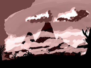
The book tells about the exterior entrance of a cave with depth and lava which is more of an mountains mouth. So i planed on making the cave entrance as mountains mouth cause the author tells the entrance which is more made of a depth which is actually a mountains mouth and the only entrance to exit of the centre.


Continue Reading...

land of prehistoric skeleton shells (Complete)

the final image of  concept art. Gave some final brush strokes for the rock and sand to make it a bit more wet.

Continue Reading...

land of prehistoric skeleton shells(unf)

A sketch and a couple of try out for the land of prehistoric skeleton shells .


Continue Reading...

concept art land of prehistoric skeleton shells

In the book there is a land with prehistoric shells covering the ground with a sea and a lonely human scull to be found and I felt this scene to be more of a likeness and thought of creating something more of a land. Did a couple of research on the shells to make the land.


Continue Reading...

Thursday, November 19, 2009

maya building (tutorial) complete


I tried to add some new texture with the final piece of maya building as i have completed the uv for the windows and doors.
Continue Reading...

Monday, November 16, 2009

Todays movie in lecture theatre


Today's Film was exiting and the music was enjoyable. The art of the character and the location was wonderful with the buildings and snow. The story of an uncommon man with a scissor hand, who happens to fall in love with a girl, with a little tragic ending. As in the end he goes back to the place were he came from despite how much he wanted to fit in. This Film is more of dark fairy tale as the character is dressed up more of a Gothic and this story also resembles to the novel written by Mary Shelley The Frankenstein.
Continue Reading...

Friday, November 13, 2009

Todays photoshop class


Today i learnt some tricks  in photoshop and tried something different and as today's final Maya class of uv layout for the building been completed, I decided to collect some texture to make 3 different images out of the maya model which i uploaded a few days earlier and decided to upload it as i get the images and complete with the uv layout.
Continue Reading...

Wednesday, November 11, 2009

concept art ideas


I been repeatedly trying to create a concept art and my own scene with an idea based on the movie journey to the centre of the earth. Since the land seems to be more prehistoric in plants and creatures, I tried making an island with a scull which looks more like an hell hounds as i thought this skull might show the border between two worlds and the deferences.


I also thought of creating a prehistoric atmosphere with carnivorous and poisonous plants. I been working on it to make it more natural by mixing sketches and a decent image.


Continue Reading...

Sunday, November 8, 2009

Concept art photoshop


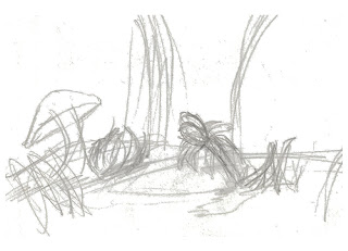
This is my concept art based on the journey to the centre of the earth from my folder 2. I took this idea from the image were i seen a group of men land in the land of huge mushrooms i took it to come up in an idea to work out my skill in tablet painting though i still find myself much to work on the shadow and smoothness of the image.

I took the concept from this image which shows a scene taken from the book journey to the centre of the earth by jules verne(1864). Its a wonderful story  and i am still trying to workout with the brushes and strokes. And i also watched the latest movie of the journey to the centre of the earth(2008).


This film has a lot of graphic to it and was interesting to watch though i like to admit  that i liked to read the book in which the story defers compared to the film.


Continue Reading...

Thursday, November 5, 2009

maya building (tutorial)


I finally completed making the building in maya, the latest tutorial of alen. It did take me a lot of time though that I didn't realise all my hours pass by easily. I had to sit and spend a lot of time in the uv then the modelling. Though i somehow managed finished the model....
Continue Reading...

Wednesday, November 4, 2009

maya whiskey tutorial


An tecturing work of maya whiskey. I am also working on the lightning and the modeling work but been stuck with the buildings i been making in which the poly mesh got a little lapped up. And i also been trying to pick a good essay were i can add up some thoughts to it.
Continue Reading...

Sunday, November 1, 2009

photoshop tablet painting


I tried to make a miss shaped building with the paint brush using the tablet which i learnt from my photoshop session, in which i tried to use the ideas similar to the movies i watched in the lecture theatre which is dr.cabinet and metropolis. which i felt a very interesting movie and to see if i could try a way to paint somewhat similar to it, from the buildings and paintings i seen in the movie.Which is more of a black and white silent movie.


This would be another imagination of my own which i painted the whole scene with the tablet using brushes and dodge. The whole scene seem to be more attractive to me for the colour I picked.
Continue Reading...